
🌸🌸🌸 Cherry Blossoms Pt. 3
Same data, different charts.

Another ✨reimagined✨ view of the cherry blossom data (part 1 and part 2 here):
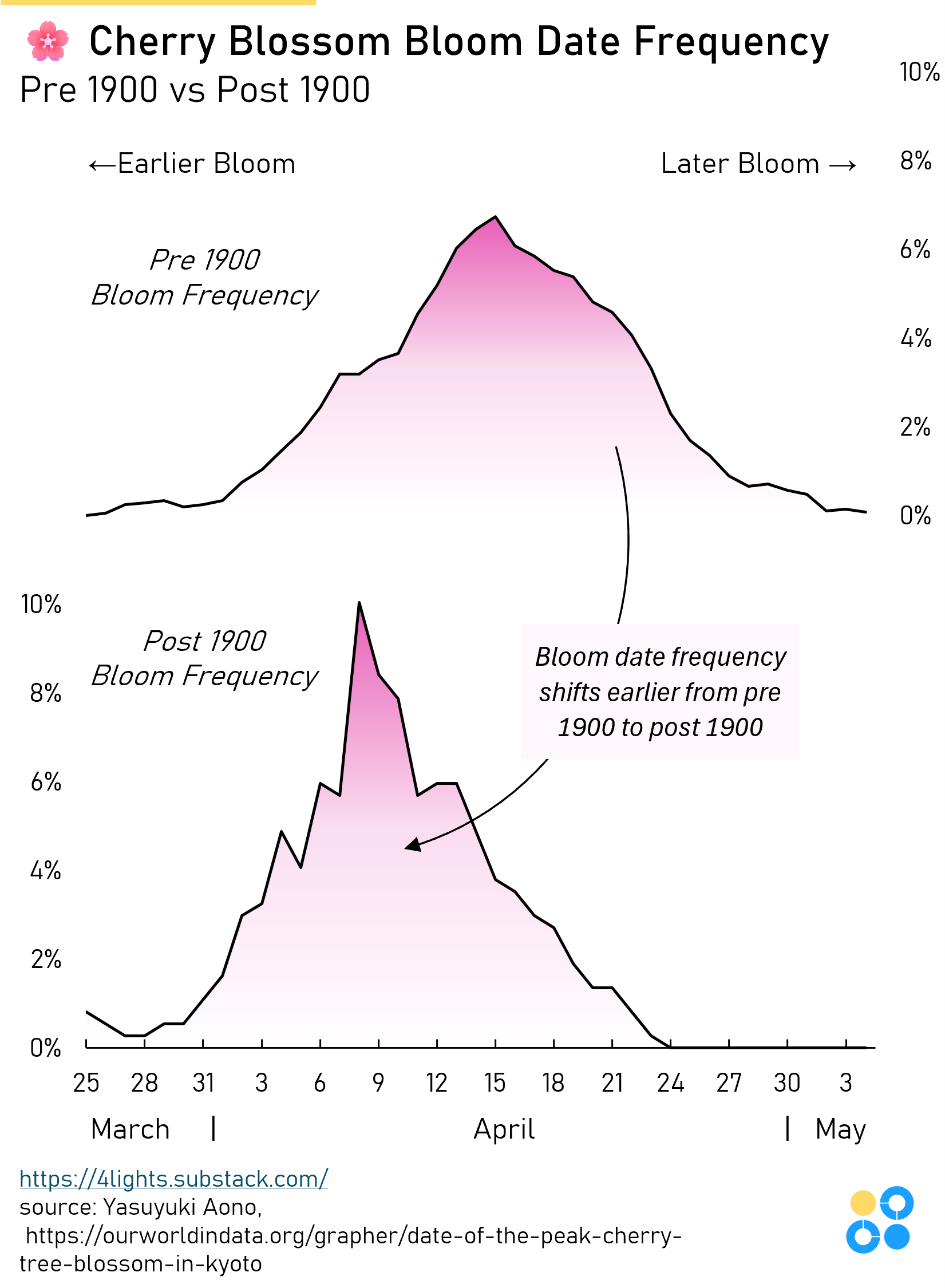
Again, similar aesthetic and color scheme with date of bloom arranged left to right, but Pt. 3 of this experiment essentially collapses ~1200 years of data into two comparable distributions. Pre-1900 and post-1900 are shown as two stacked frequency density panels which allows the “earlier bloom ↔ later bloom” comparison direct and horizontal.
So where Pt. 2 prioritized showing the year-over-year trend as a continuous time series (with day-of-year as a secondary axis), Pt3 sacrifices the year dimension as a continuous axis in favor of making the earlier/later shift in bloom timing the primary, immediately legible takeaway.
What do you think? Pt. 1, Pt. 2, or Pt. 3?


