
🌸🌸 Cherry Blossoms Pt. 2
Same data, different charts.

When 4 Lights launched, the intention was to write as much about how to visualize data as about the data itself. The cherry blossom dataset is a personal favorite — 1,200 years of bloom dates painstakingly extracted from historical records — and it turns out one chart is never enough. Here’s the same data ✨reimagined✨:
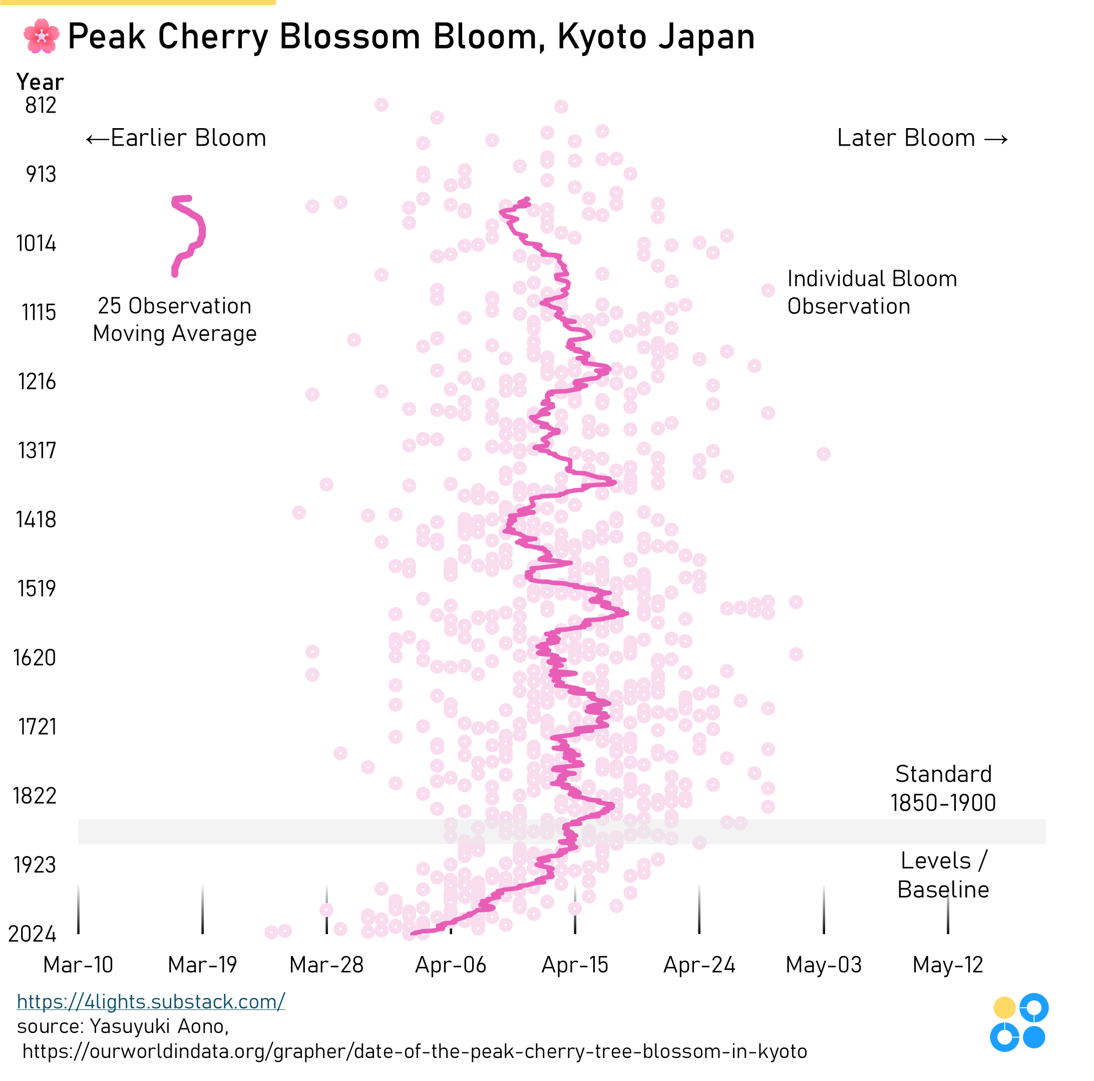
The general aesthetic and color scheme is the same, but the axes are flipped. As a general rule, a time dimension (i.e. year) should almost always run left to right. However, this dataset is unique in that it’s two time dimensions: year and day of the year.
In the prior chart from last month, the years run left/right which forces the day of the year to orient up/down. Mapping earlier in the year and later in the year to up/down is counterintuitive. Since the intent of this data is to visualize the bloom dates getting earlier in the year, it made sense to reorient the graph to make that earlier/later dynamic more intuitive.
What you think? This version or the prior version?

