


🌶️ Hot Ones spicy data: part 1
An entertaining show with unique data

Hot Ones is a wildly entertaining show. The guests are great; the questions are great; the reactions are great; and Sean's Chicago-ness is great. But what about looking at the show's data?
In particular, the sauce spiciness (Scoville units) and how it has evolved over 20+ seasons. The challenging thing about visualizing the hot sauce data is its exponential nature — each round of hot sauce is several times hotter than the previous one. Choosing the right graphic is hard for exponential data. Reporters, data journalists, and scientists debated this during the exponential growth phase of the COVID-19 pandemic. There’s even research suggesting that log scales affected people’s understanding of the disease.
My first attempt at doing something interesting with this data probably turned out a little too busy — I really prefer simple graphics — but here it is.
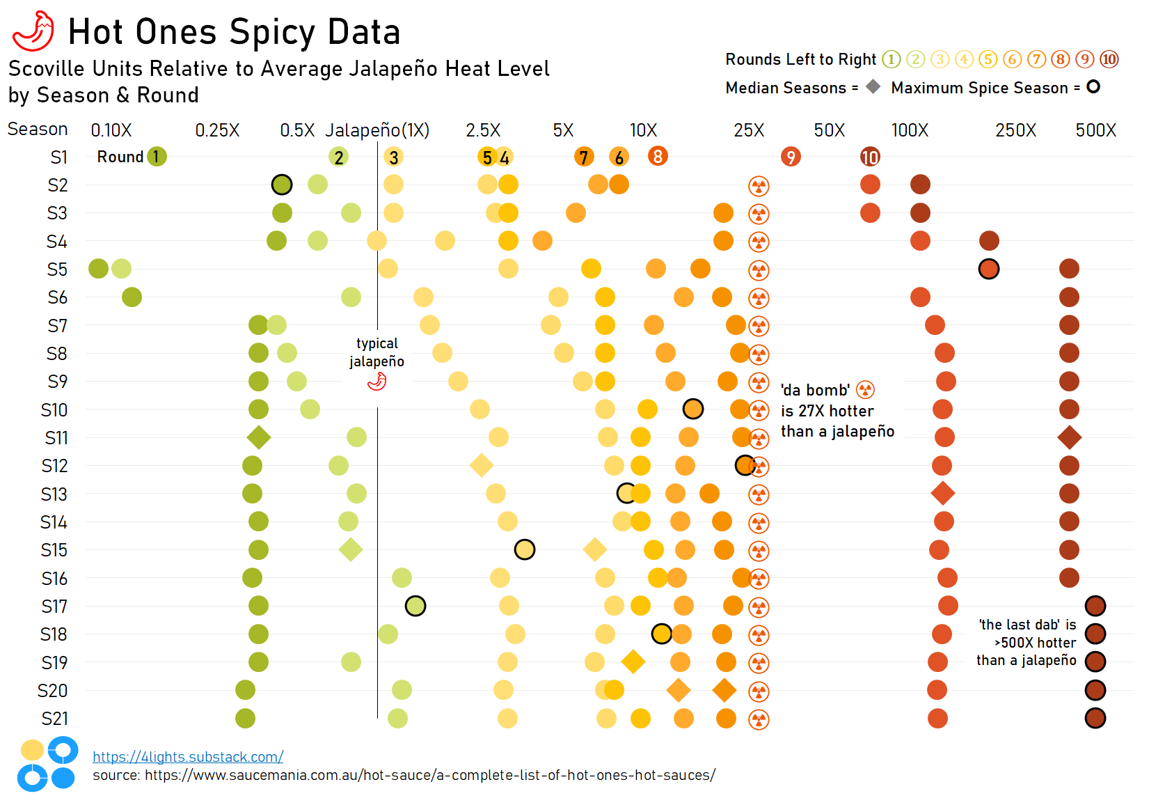
So what’s going on here?
Data Transformation
The base data is in Scoville units (SHU), which is hard to conceptualize. So, I needed a way to transform the data into something relatable, like the average SHU of jalapeños (5,000 SHU). I think it’s a lot easier to imagine something 10x hotter than a jalapeño versus 50,000 Scoville units. Transforming data is an important part of any analysis, and making data relatable through transformation shouldn’t be overlooked.
Context Clues
Context is really important in analysis, and it’s probably something that a lot of analysts take for granted when presenting their work. In this case, context is sprinkled throughout the viz.
To give a sense of the average (actually median) round’s spice level the circles are replaced with ◆. To identify the spiciest season, the circles are highlighted with ○.
Colors 🟢🟡🟠🔴
Here’s where it probably went off the rails a bit. The colors are more of a reference to the show’s onscreen graphics; I typically recommend not to use more than 3 colors in a visualization.