Cool data visualization and a hot planet
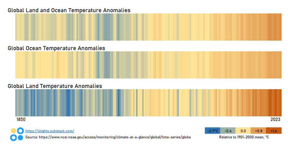
This viral data visualization tells the story of modern global warming in a simple, useful way.
This style of graphic is hot in the climate and “energy transition” world. (It even has its own Wikipedia page!)
It’s simple and unfussy, and it clearly tells a (distressing) story. The data is easy to source (NOAA Global Time Series). Even better, this style of visualization is easy to produce in everyday programs like Excel or Google Sheets.
A couple of differences between mine and the one posted on climate.gov:
While I appreciate minimalism, I still recommend graphics include some kind of label or legend - particularly when dealing with color scales.
The blue → white → red color scheme 🟦⬜🟥 on the original isn’t bad (very patriotic), but I chose a blue → yellow-ish → orange scheme 🟦🟨🟧. Both perform fairly well on a color blind simulation which is important - and often overlooked - in graphics.
Want a personalized Excel or Google Sheet workbook that can create this graphic for you? Send me an email: 4lightsdata@gmail.com


